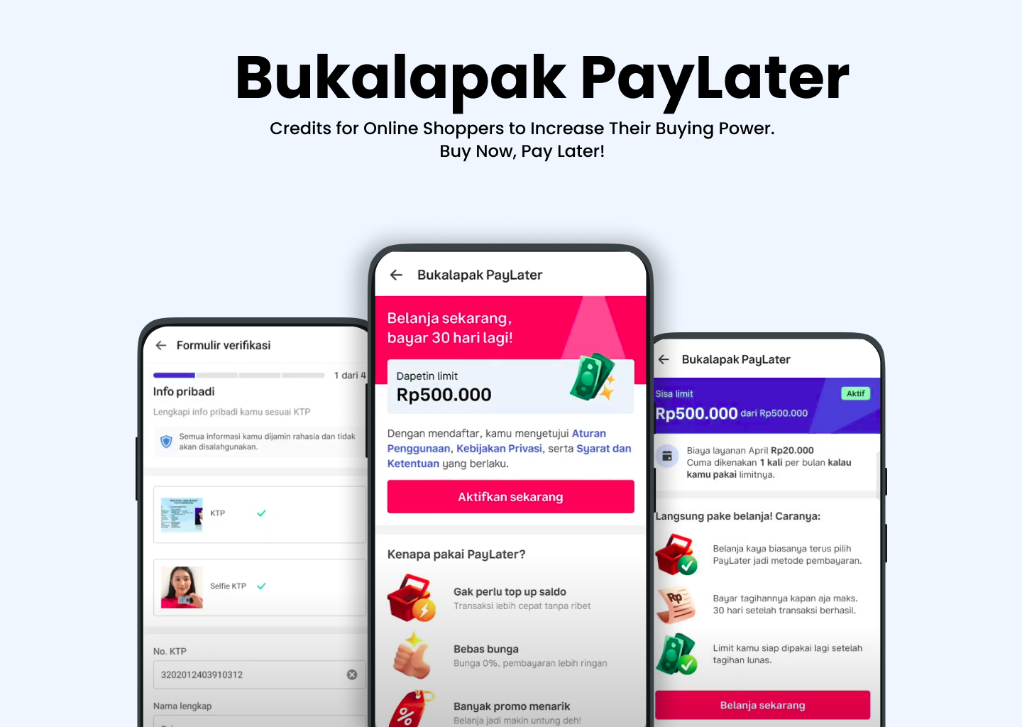
Bayar Tempo: Credits for Shop Owners
mobile web
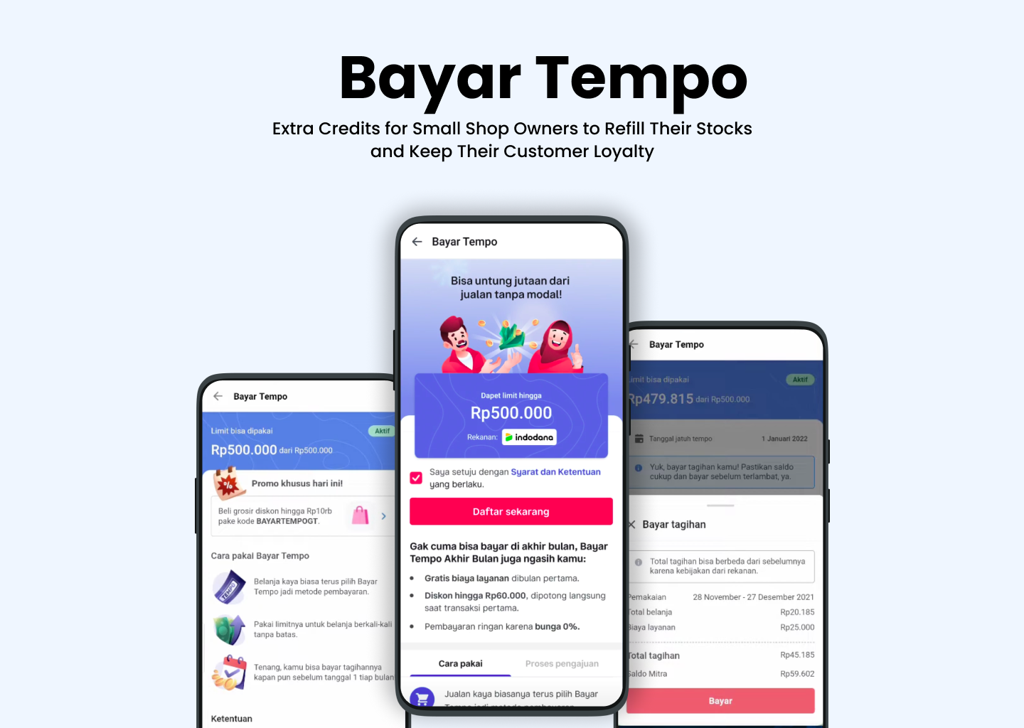
"Bayar Tempo" is a web-based solution designed to empower small shop owners, known as "warung" in Indonesia, by providing them with extra credits to maintain their stock levels. This innovative platform enhances customer loyalty and satisfaction while creating an additional revenue stream for Bukalapak. Utilizing cutting-edge technologies like Vue.js, micro-frontends, and Kubernetes on Google Cloud Platform, the project showcases my expertise in frontend development and unit testing, ensuring a robust and scalable application.