Enable Tailwind Dark Mode in Next.js and Storybook
Nowadays, dark mode on web pages becomes popular because it provides more comfort for some people, including me. Using Tailwind we can configure it easily and choose one of 2 available strategies, the media strategy which leverage preferes-color-scheme CSS media feature and class strategy which use dark class in HTML document. In this article, we will enable Tailwind dark mode in the Next.js project, and also configure Storybook to simulate dark mode in component documentation.
Configure the dark mode
Starting from this step, I assume we already have a project bootstrapped using Next.js and Tailwind. If you need help setting it up, hopefully, this article can be useful. Within this step, we would like to configure the dark mode using class strategy.
- Configure dark mode
classstrategy intailwind.config.jsmodule.exports = { ... darkMode: 'class', ... }; - Update
styles/global.cssto switch background and text color based color mode@tailwind base; @tailwind components; @tailwind utilities; body { @apply bg-white text-slate-800 dark:bg-slate-900 dark:text-slate-300; }We use
dark:prefix to apply specific style only for dark mode. - Also, add some dark mode styling in
pages/index.tsximport type { NextPage } from 'next'; import Head from 'next/head'; const Home: NextPage = () => { return ( <> <Head> <title>Next.js Tailwind</title> <meta content="Generated by create next app" name="description" /> <link href="/favicon.ico" rel="icon" /> </Head> <div className="bg-primary-500 absolute left-0 top-64 -z-10 h-72 w-72 rounded-full opacity-10 blur-3xl"></div> <div className="bg-danger-500 absolute right-0 top-24 -z-10 h-72 w-72 rounded-full opacity-10 blur-3xl"></div> <section className="container mx-auto py-16 px-6 text-center sm:py-40"> <h1 className="mx-auto w-3/4 pb-10 text-4xl font-bold text-slate-900 dark:text-slate-100 sm:text-5xl"> Next.js Tailwind </h1> <p>A great combination of Next.js and Tailwind.</p> </section> </> ); }; export default Home;In the above example, dark mode styling is added in
h1tag. - Let’s test the configuration by running
yarn dev, then adddarkclass into the HTML.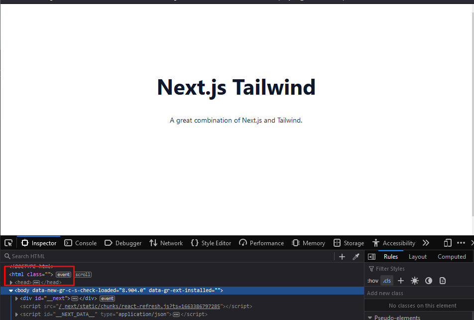
Light mode 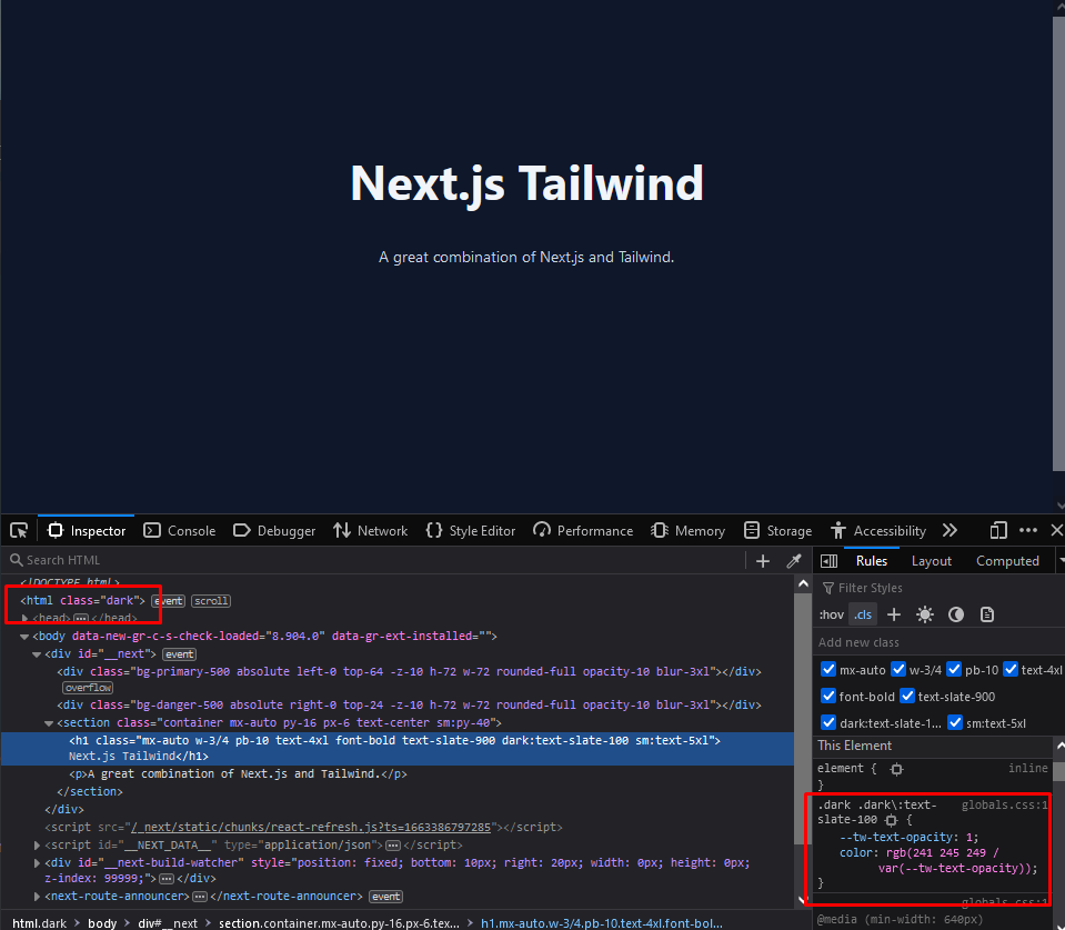
Dark mode activated and style with dark: prefix is applied
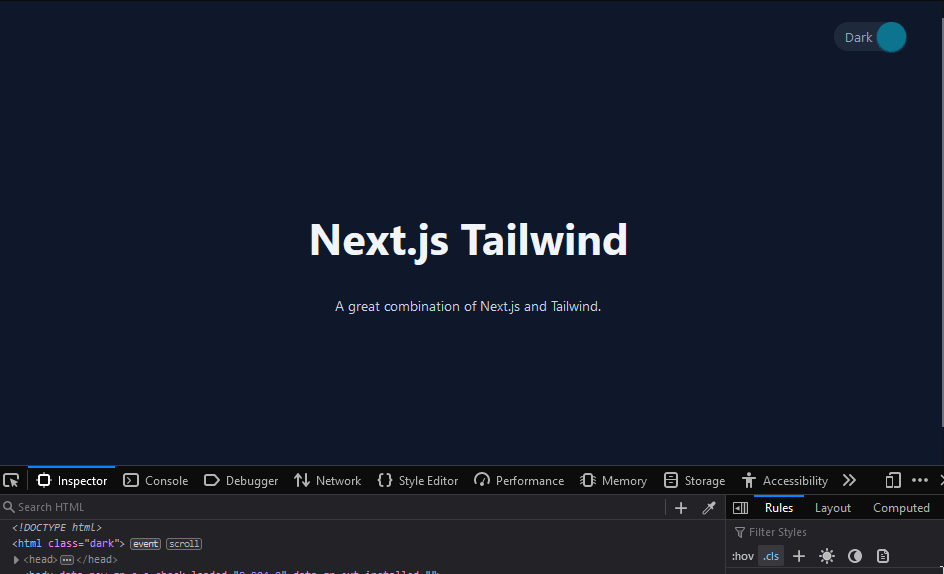
Create a color mode switcher component
To make it easier for switching between color modes, let’s create a component for it.
- Create a component named
components/ColorModeToggle.tsxexport interface ColorModeToggleProps { className?: string; dark?: boolean; onChange?: (dark: boolean) => void; } export default function ColorModeToggle({ className = '', dark, onChange, }: ColorModeToggleProps) { return ( <div className={`relative flex h-8 w-20 cursor-pointer rounded-full bg-slate-50 dark:bg-slate-800 ${className}`} onClick={() => onChange?.(!dark)} > <div className={`absolute h-8 w-8 rounded-full shadow transition-transform ${ dark ? 'translate-x-12 bg-slate-800 shadow-slate-800 dark:bg-cyan-700 dark:shadow-cyan-700' : 'left-0 bg-amber-300 shadow-amber-300' }`} ></div> <div className={`w-full px-3 text-sm leading-8 transition-all dark:text-slate-400 ${ dark ? 'text-left' : 'text-right' }`} > {dark ? 'Dark' : 'Light'} </div> </div> ); } - Create
providers/ColorModeProvider.tsxand leverage React Context to save our color mode states as a global state so it can be easily reused across componentsimport { createContext, ReactNode, useCallback, useEffect, useState, } from 'react'; import { useRouter } from 'next/router'; export interface ColorModeContextValue { dark: boolean; toggleColorMode: (becomeDark: boolean) => void; } export const ColorModeContext = createContext<ColorModeContextValue>({ dark: false, toggleColorMode: () => { /*do nothing */ }, }); export interface ColorModeProviderProps { children?: ReactNode; } export default function ColorModeProvider({ children, }: ColorModeProviderProps) { const [dark, setDark] = useState(false); const router = useRouter(); const setDarkClassName = useCallback((becomeDark: boolean) => { if (becomeDark) { global.document.documentElement.classList.add('dark'); } else { global.document.documentElement.classList.remove('dark'); } }, []); const toggleColorMode = (becomeDark: boolean) => { setDark(becomeDark); setDarkClassName(becomeDark); global.localStorage.theme = becomeDark ? 'dark' : 'light'; }; useEffect(() => { const isCurrentlyDark = router.query?.theme === 'dark' || window.localStorage?.theme === 'dark'; setDark(isCurrentlyDark); setDarkClassName(isCurrentlyDark); }, [router, setDark, setDarkClassName]); return ( <ColorModeContext.Provider value={{ dark, toggleColorMode, }} > {children} </ColorModeContext.Provider> ); } - Put the provider in
pages/_app.tsximport '../styles/globals.css'; import type { AppProps } from 'next/app'; import ColorModeProvider from 'providers/ColorModeProvider'; function MyApp({ Component, pageProps }: AppProps) { return ( <ColorModeProvider> <Component {...pageProps} /> </ColorModeProvider> ); } export default MyApp; - If you find a TypeScript error in
pages/_app.tsxsaying “Cannot find module ‘providers/ColorModeProvider’” like this, then addbaseUrlintotsconfig.json
TypeScript cannot find providers directory { "compilerOptions": { "baseUrl": ".", ... } }Re-open
pages/_app.tsxto see the effect. - Create
components/Header.tsxto place the toggle componentimport { useContext } from 'react'; import { ColorModeContext } from 'providers/ColorModeProvider'; import ColorModeToggle from './ColorModeToggle'; export default function Header() { const { dark, toggleColorMode } = useContext(ColorModeContext); return ( <header className="container mx-auto flex items-center justify-end p-6"> <ColorModeToggle className="ml-4" dark={dark} onChange={toggleColorMode} /> </header> ); } - Reuse header component in any pages, for example in
pages/index.tsximport type { NextPage } from 'next'; import Head from 'next/head'; import Header from 'components/Header'; const Home: NextPage = () => { return ( <> <Head> <title>Next.js Tailwind</title> <meta content="Generated by create next app" name="description" /> <link href="/favicon.ico" rel="icon" /> </Head> <Header /> <div className="bg-primary-500 absolute left-0 top-64 -z-10 h-72 w-72 rounded-full opacity-10 blur-3xl"></div> <div className="bg-danger-500 absolute right-0 top-24 -z-10 h-72 w-72 rounded-full opacity-10 blur-3xl"></div> <section className="container mx-auto py-16 px-6 text-center sm:py-40"> <h1 className="mx-auto w-3/4 pb-10 text-4xl font-bold text-slate-900 dark:text-slate-100 sm:text-5xl"> Next.js Tailwind </h1> <p>A great combination of Next.js and Tailwind.</p> </section> </> ); }; export default Home; - Let’s test the configuration by switching the color mode using our new component.
Configure dark mode in Storybook
There are several alternatives to enable dark mode in Storybook but I use storybook-dark-mode addon because my plan is to make the whole parts in Storybook UI changed when the color mode is changed and this addon supports it very well.
- Install dependencies
yarn add -D storybook-dark-mode - Integrate the addon and configure directory aliases in
.storybook/main.jsmodule.exports = { ... addons: [ ... 'storybook-dark-mode', ], webpackFinal: async (config) => { // use tailwind via postcss-loader config.module.rules.push({ test: /\.css$/, use: ['postcss-loader'], include: path.resolve(__dirname, '../'), }); // define aliases for each directory not provided by Next.js by default config.resolve.alias = { ...config.resolve.alias, components: path.resolve(__dirname, '../components'), providers: path.resolve(__dirname, '../providers'), }; return config; }, ... }; - Create
.storybook/constants.jsand put the dark theme color configuration here. We need to share this configuration in multiple files in the next step.import { themes } from '@storybook/theming'; export const darkTheme = { ...themes.dark, appBg: '#0f172a', appContentBg: '#0f172a', barBg: '#0f172a', };I use Tailwind’s
bg-slate-900(#0f172a) as background color for dark mode. - Create
.storybook/DocsContainer.tsxas a custom docs containerimport React from 'react'; import { DocsContainer as BaseContainer, DocsContainerProps, } from '@storybook/addon-docs/blocks'; import { themes } from '@storybook/theming'; import { useDarkMode } from 'storybook-dark-mode'; import { darkTheme } from './constants'; // Thanks to https://github.com/hipstersmoothie/storybook-dark-mode/issues/127#issuecomment-1070524402 export function DocsContainer({ context, ...props }: DocsContainerProps) { const dark = useDarkMode(); const finalProps = { ...props, context: { ...context, storyById: (id) => { const storyContext = context.storyById(id); return { ...storyContext, parameters: { ...storyContext?.parameters, docs: { ...storyContext?.parameters?.docs, theme: dark ? darkTheme : themes.light, }, }, }; }, }, }; return <BaseContainer {...finalProps} />; }For the time being,
storybook-dark-modeaddon can’t automatically apply dark mode colors into docs view, so we need this custom container to leverageuseDarkModehook and change the color of docs based on the active color theme. Thanks to the community for providing this solution. - Update
.storybook/preview.jsto configure dark mode and custom docs container// add the following imports after the existing imports import { darkTheme } from './constants'; import { DocsContainer } from './DocsContainer'; export const parameters = { ... darkMode: { classTarget: 'html', dark: darkTheme, stylePreview: true, }, docs: { container: DocsContainer, }, ... };Using this configuration, we put
darkclass in the<html>tag, use the colors we’ve defined earlier, and enable dark mode for canvas and docs view. - Test the configuration by running
yarn storybook
Now we have dark mode configured in the web app and Storybook. Read more on Tailwind dark mode documentation for more information about how to use the dark mode. Have a nice day!